3 Approaching analysis
INCOMPLETE DRAFT
Statistical thinking will one day be as necessary for efficient citizenship as the ability to read and write.
— H.G. Wells
The essential questions for this chapter are:
- What is the role of statistics in data analysis?
- What is the importance of descriptive assessment in data analysis?
- In what ways are main approaches to data analysis similar and different?
In this chapter I will build on the notions of data and information from the previous chapter. The aim of statistics in quantitative analysis is to uncover patterns in datasets. Thus statistics is aimed at deriving knowledge from information, the next step in the DIKI Hierarchy (Figure 2.3). Where the creation of information from data involves human intervention and conscious decisions, as we have seen, deriving knowledge from information involves even more conscious subjective decisions on what information to assess, and what method to select to interrogate the information, and ultimately how to interpret the findings. The first step is to conduct a descriptive assessment of the information, both at the individual variable level and also between variables, the second is to interrogate the dataset either through inferential, predictive, or exploratory analysis methods, and the third is to interpret and report the findings.
3.1 Description
A descriptive assessment of the dataset includes a set of diagnostic measures and tabular and visual summaries which provide researchers a better understanding of the structure of a dataset, prepare the researcher to make decisions about which statistical methods and/ or tests are most appropriate, and to safeguard against false assumptions (missing data, data distributions, etc.). In this section we will first cover the importance of understanding the informational value that variables can represent and then move to use this understanding to approach summarizing individual variables and relationships between variables.
To ground this discussion I will introduce a new dataset. This dataset is drawn from the Barcelona English Language Corpus (BELC), which is found in the TalkBank repository. I’ve selected the “Written composition” task from this corpus which contains writing samples from second language learners of English at different ages. Participants were given the task of writing for 15 minutes on the topic of “Me: my past, present and future”. Data was collected for many (but not all) participants up to four times over the course of seven years. In Table 3.1 I’ve included the first 10 observations from the dataset which reflects structural and transformational steps I’ve done so we start with a tidy dataset.
| participant_id | age_group | sex | num_tokens | num_types | ttr |
|---|---|---|---|---|---|
| L02 | 10-year-olds | female | 12 | 12 | 1.000 |
| L05 | 10-year-olds | female | 18 | 15 | 0.833 |
| L10 | 10-year-olds | female | 36 | 26 | 0.722 |
| L11 | 10-year-olds | female | 10 | 8 | 0.800 |
| L12 | 10-year-olds | female | 41 | 23 | 0.561 |
| L16 | 10-year-olds | female | 13 | 12 | 0.923 |
| L22 | 10-year-olds | female | 47 | 30 | 0.638 |
| L27 | 10-year-olds | female | 8 | 8 | 1.000 |
| L28 | 10-year-olds | female | 84 | 34 | 0.405 |
| L29 | 10-year-olds | female | 53 | 34 | 0.642 |
The entire dataset includes 79 observations from 36 participants. Each observation in the BELC dataset corresponds to an individual learner’s composition. It includes which participant wrote the composition (participant_id), the age group they were part of at the time (age_group), their sex (sex), and the number of English words they produced (num_tokens), the number of unique English words they produced (num_types). The final variable (ttr) is the calculated ratio of number of unique words (num_types) to total words (num_tokens) for each composition. This is known as the Type-Token Ratio and it is a standard metric for measuring lexical diversity.
3.1.1 Information values
Understanding the informational value, or level of measurement, of a variable or set of variables in key to preparing for analysis as it has implications for what visualization techniques and statistical measures we can use to interrogate the dataset. There are two main levels of measurement a variable can take: categorical and continuous. Categorical variables reflect class or group values. Continuous variables reflect values that are measured along a continuum.
The BELC dataset contains three categorical variables (participant_id, age_group, and sex) and three continuous variables (num_tokens, num_types, and ttr). The categorical variables identify class or group membership; which participant wrote the composition, what age group they were in, and their biological sex. The continuous variables measure attributes that can take a range of values without a fixed limit and the differences between each value are regular. The number of words and number of unique words for each composition can range from 1 to \(n\) and the Type-Token Ratio being derived from these two variables is also continuous for the same reason. Furthermore, the differences between the each of values of these measures is on a defined interval, so for example a composition which has a word count (num_tokens) of 40 is exactly two times as large as a composition with a word count of 20.
The distinction between categorical an continuous levels of measurement, as mentioned above, are the main two and for some statistical approaches the only distinction that needs to be made to conduct an analysis. However, categorical and continuous can each be broken down into subcategories and for some descriptive and analytic purposes these distinctions are important. For categorical variables a distinction can be made between variables in which there is a structured relationship between the values and those in which there is not. Nominal variables contain values which are labels denoting the membership in a class in which there is no relationship between the labels. Ordinal variables also contain labels of classes, but in contrast to nominal variables, there is a relationship between the classes, namely one in which there is a precedence relationship or order. With this in mind, our categorical variables be sub-classified. There is no order between the values of participant_id and sex and they are therefore nominal whereas the values of age_group are ordered, each value refers to a sequential age group, and therefore it is ordinal.
Turning to continuous variables, another subdivision can be made which hinges on the existence of a non-arbitrary zero or not. Interval variables contain values in which the difference between the values is regular and defined, but the measure has an arbitrary zero value. A typically cited example of an interval variable is temperature measurements on the Fahrenheit scale. A value of 0 on this scale does not mean there is 0 temperature. Ratio variables have all the properties of interval variables but also include a non-arbitrary definition of zero. All of the continuous variables in the BELC dataset (num_tokens, num_types, and ttr) are ratio variables as a value of 0 would indicate the lack of this attribute.
An hierarchical overview of the relationship between the two main and four sub-types of levels of measurement appear in Figure 3.1.
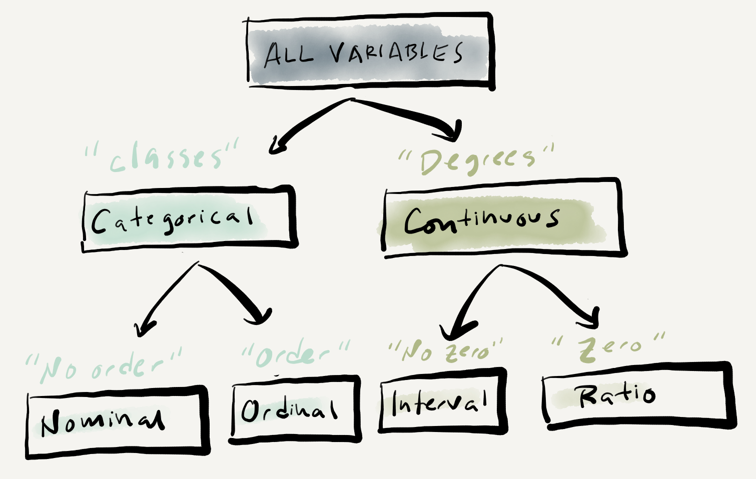
Figure 3.1: Levels of measurement graphic representation.
A few notes of practical importance; First, the distinction between interval and ratio variables is often not applicable in text analysis and therefore often treated together as continuous variables. Second, the distinction between ordinal and interval/continuous variables is not as clear cut as it may seem. Both variables contain values which have an ordered relationship. By definition the values of an ordinal variable do not reflect regular intervals between the units of measurement. But in practice interval/continuous variables with a defined number of values (say from a Likert scale used on a survey) may be treated as an ordinal variable as they may be better understood as reflecting class membership. Third, all continuous variables can be converted to categorical variables, but the reverse is not true. We could, for example, define a criterion for binning the word counts in num_tokens for each composition into ordered classes such as “low”, “mid”, “high”. On the other hand, sex (as it has been measured here) cannot take intermediate values on a unfixed range. The upshot is that variables can be down-typed but not up-typed. In most cases it is preferred to treat continuous variables as such, if the nature of the variable permits it, as the down-typing of continuous data to categorical data results in a loss of information –which will result in a loss of information and hence statistical power which may lead to results that obscure meaningful patterns in the data (R. Harald Baayen, 2004).
3.1.2 Summaries
It is always key to gain insight into shape of the information through numeric, tabular and/ or visual summaries before jumping in to analytic statistical approaches. The most appropriate form of summarizing information will depend on the number and informational value(s) of our target variables. To get a sense of how this looks, let’s continue to work with the BELC dataset and pose different questions to the data with an eye towards seeing how various combinations of variables are descriptively explored.
3.1.2.1 Single variables
The way to statistically summarize a variable into a single measure is to derive a measure of central tendency. For a continuous variable the most common measure is the (arithmetic) mean, or average, which is simply the sum of all the values divided by the number of values. As a measure of central tendency, however, the mean can be less-than-reliable as it is sensitive to outliers which is to say that data points in the variable that are extreme relative to the overall distribution of the other values in the variable affect the value of the mean depending on how extreme the deviate. One way to assess the effects of outliers is to calculate a measure of dispersion. The most common of these is the standard deviation which estimates the average amount of variability between the values in a continuous variable. Another way to assess, or rather side-step, outliers is to calculate another measure of central tendency, the median. A median is calculated by sorting all the values in the variable and then selecting the value which falls in the middle of all the other values. A median is less sensitive to outliers as extreme values (if there are few) only indirectly affect the selection of the middle value. Another measure of dispersion is to calculate quantiles. A quantile slices the data in four percentile ranges providing a five value numeric summary of the spread of the values in a continuous variable. The spread between the first and third quantile is known as the Interquartile Range (IQR) and is also used as a single statistic to summarize variability between values in a continuous variable.
Below is a list of central tendency and dispersion scores for the continuous variables in the BELC dataset.
Variable type: numeric
| skim_variable | n_missing | complete_rate | mean | sd | p0 | p25 | p50 | p75 | p100 | iqr |
|---|---|---|---|---|---|---|---|---|---|---|
| num_tokens | 0 | 1 | 66.23 | 43.90 | 1.00 | 29.00 | 55.00 | 90.00 | 185 | 61.00 |
| num_types | 0 | 1 | 40.25 | 22.80 | 1.00 | 22.00 | 38.00 | 54.00 | 97 | 32.00 |
| ttr | 0 | 1 | 0.67 | 0.13 | 0.41 | 0.57 | 0.64 | 0.73 | 1 | 0.16 |
The descriptive statistics returned above were generated by the skimr package.
In the above summary, we see the mean, standard deviation (sd), and the quantiles (the five-number summary, p0, p25, p50, p75, and p100). The middle quantile (p50) is the median and the IQR is listed last.
These are important measures for assessing the central tendency and dispersion and will be useful for reporting purposes, but to get a better feel of how a variable is distributed, nothing beats a visual summary. A boxplot graphically summarizes many of these metrics. In Figure 3.2 we see the same three continuous variables, but now in graphical form.
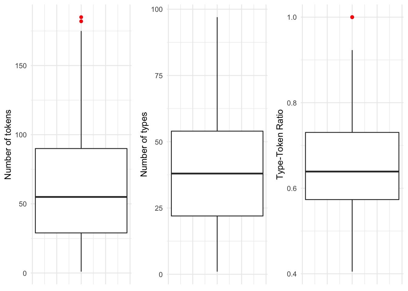
Figure 3.2: Boxplots for each of the continuous variables in the BELC dataset.
In a boxplot, the bold line is the median. The surrounding box around the median is the interquantile range. The extending lines above and below the IQR mark the largest and lowest value that is within 1.5 times either the 3rd (top of the box) or 1st (bottom of the box). Any values that fall outside, above or below, the extending lines are considered statistical outliers and are marked as dots (in this case red dots). 7
Boxplots provide a robust and visually intuitive way of assessing central tendency and variability in a continuous variable but this type of plot can be complemented by looking at the overall distribution of the values in terms of their frequencies. A histogram provides a visualization of the frequency (and density in this case with the blue overlay) of the values across a continuous variable binned at regular intervals.
In Figure 3.3 I’ve plotted histograms in the top row and density plots in the bottom row for the same three continuous variables from the BELC dataset.
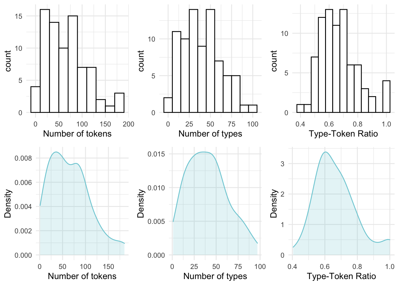
Figure 3.3: Histograms and density plots for the continuous variables in the BELC dataset.
Histograms provide insight into the distribution of the data. For our three continuous variables, the distributions happen not to be too strikingly distinct. They are, however, not the same either. When we explore continuous variables with histograms we are often trying to assess whether there is skew or not. There are three general types of skew, visualized in Figure 3.4.
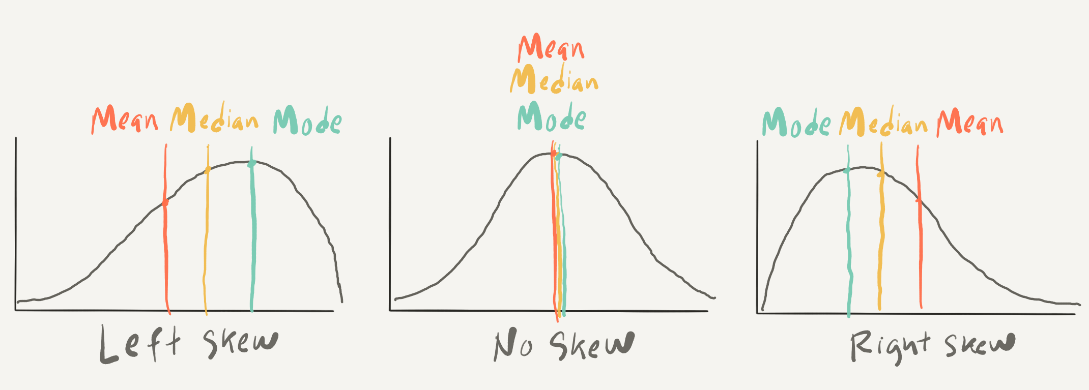
Figure 3.4: Examples of skew types in density plots.
In histograms/ density plots in which the distribution is either left or right, the median and the mean are not aligned. The mode, which indicates the most frequent value in the variable is also not aligned with the other two measures. In a left-skewed distribution the mean will be to the left of the median which is left of the mode whereas in a right-skewed distribution the opposite occurs. In a distribution with absolutely no skew these three measures are the same. In practice these measures rarely align perfectly but it is very typical for these three measures to approximate alignment. It is common enough that this distribution is called the Normal Distribution 8 as it is very common in real-world data.
Another and potentially more informative way to inspect the normality of a distribution is to create Quantile-Quantile plots (QQ Plot). In Figure 3.5 I’ve created QQ plots for our three continuous variables. The line in each plot is the normal distribution and the more points that fall off of this line, the less likely that the distribution is normal.
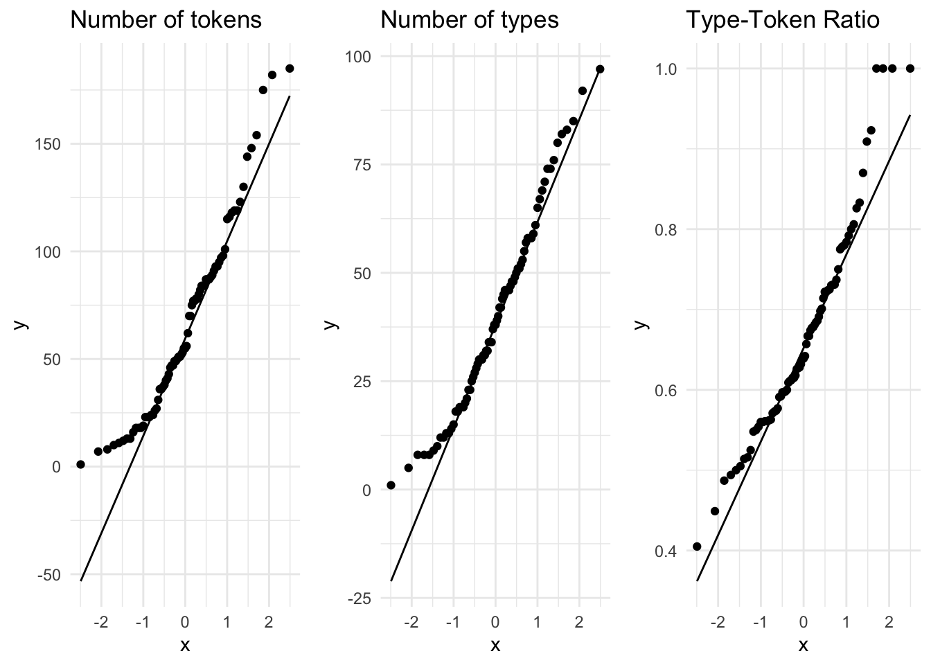
Figure 3.5: QQ Plots for the continuous variables in the BELC dataset.
A visual inspection can often be enough to detect non-normality, but in cases which visually approximate the normal distribution (such as these) we can perform the Shapiro-Wilk test of normality. This is an inferential test that compares a variable’s distribution to the normal distribution. The likelihood that the distribution differs from the normal distribution is reflected in a \(p\)-value. A \(p\)-value below the .05 threshold suggests the distribution is non-normal. In Table 3.2 we see that given this criterion only the distribution of num_types is normally distributed.
| variable | statistic | p_value |
|---|---|---|
| Number of tokens | 0.942 | 0.001 |
| Number of types | 0.970 | 0.058 |
| Type-Token Ratio | 0.947 | 0.003 |
Downstream in the analytic analysis, the distribution of continuous variables will need to be taken into account for certain statistical tests. Tests that assume ‘normality’ are parametric tests, those that do not are non-parametric. Distributions which approximate the normal distribution can sometimes be transformed to conform to the normal distribution either by outlier trimming or through statistical procedures (e.g. square root, log, or inverse transformation), if necessary. At this stage, however, the most important thing is to recognize whether the distributions approximate or wildly diverge from the normal distribution.
Before we leave continuous variables, let’s consider another approach for visually summarizing a single continuous variable. The Empirical Cumulative Distribution Frequency, or ECDF, is a summary of the cumulative proportion of each of the values of a continuous variable. An ECDF plot can be useful in determining what proportion of the values fall above or below a certain percentage of the data.
In Figure 3.6 we see ECDF plots for our three continuous variables.
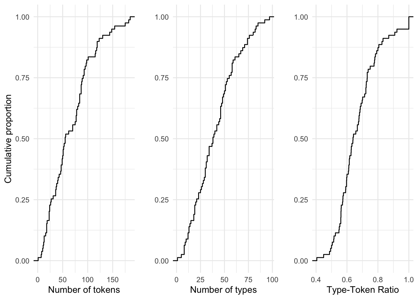
Figure 3.6: ECDF plots for the continuous variables in the BELC dataset.
Take, for example, the number of tokens (num_tokens) per composition. The ECDF plot tells us that 50% of the values in this variable are 56 words or less. In the three variables plotted, the cumulative growth is quite steady. In some cases it is not. When it is not, an ECDF goes a long way to provide us a glimpse into key bends in the proportions of values in a variable.
Now let’s turn to the descriptive assessment of categorical variables. For categorical variables, central tendency can be calculated as well but only a subset of measures given the reduced informational value of categorical variables. For nominal variables where there is no relationship between the levels the central tendency is simply the mode. The levels of ordinal variables, however, are relational and therefore the median, in addition to the mode, can also be used as a measure of central tendency. Note that a variable with one mode is unimodal, two modes, bimmodal, and in variables that have two or more modes multimodal.
To get numeric value of the median for an ordinal variable the levels of the variable will need to be numeric as well. Non-numeric levels can be recoded to numeric for this purpose if necessary.
Below is a list of the central tendency metrics for the categorical variables in the BELC dataset.
Variable type: factor
| skim_variable | n_missing | complete_rate | ordered | n_unique | top_counts |
|---|---|---|---|---|---|
| participant_id | 0 | 1 | FALSE | 36 | L05: 3, L10: 3, L11: 3, L12: 3 |
| age_group | 0 | 1 | TRUE | 4 | 10-: 24, 16-: 24, 12-: 16, 17-: 15 |
| sex | 0 | 1 | FALSE | 2 | fem: 48, mal: 31 |
In practice when a categorical variable has few levels it is common to simply summarize the counts of each level in a table to get an overview of the variable. With ordinal variables with more numerous levels, the five-score summary (quantiles) can be useful to summarize the distribution. In contrast to continuous variables where a graphical representation is very helpful to get perspective on the shape of the distribution of the values, the exploration of single categorical variables is rarely enhanced by plots.
3.1.2.2 Multiple variables
In addition to the single variable summaries (univariate), it is very useful to understand how two (bivariate) or more variables (multivariate) are related to add to our understanding of the shape of the relationships in the dataset. Just as with univariate summaries, the informational values of the variables frame our approach.
To explore the relationship between two continuous variables we can statistically summarize a relationship with a coefficient of correlation which is a measure of effect size between continuous variables. If the continuous variables approximate the normal distribution Pearson’s r is used, if not Kendall’s tau is the appropriate measure. A correlation coefficient ranges from -1 to 1 where 0 is no correlation and -1 or 1 is perfect correlation (either negative or positive). Let’s assess the correlation coefficient for the variables num_tokens and ttr. Since these variables are not normally distributed, we use Kendall’s tau. Using this measure the correlation coefficient is \(-0.563\) suggesting there is a correlation, but not a particularly strong one.
Correlation measures are important for reporting but to really appreciate a relationship it is best to graphically represent the variables in a scatterplot. In Figure 3.7 we see the relationship between num_tokens and ttr.
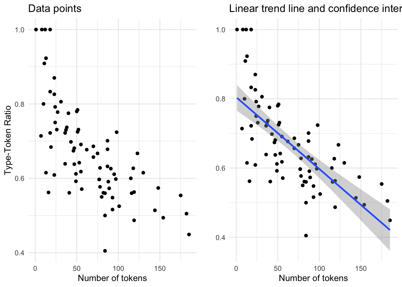
Figure 3.7: Scatterplot…
In both plots ttr is on the y-axis and num_tokens on the x-axis. The points correspond to the intersection between these variables for each single observation. In the left pane only the points are represented. Visually (and given the correlation coefficient) we can see that there is a negative relationship between the number of tokens and the Type-Token ratio: in other words, the more tokens a composition has the lower the Type-Token Ratio. In this case this trend is quite apparent, but in other cases is may not be. To provide an additional visual cue a trend line is often added to a scatterplot. In the right pane I’ve added a linear trend line. This line demarcates the optimal central tendency across the relationship, assuming a linear relationship. The steeper the line, or slope, the more likely the correlation is strong. The band, or ribbon, around this trend line indicates the confidence interval which means that real central tendency could fall anywhere within this space. The wider the ribbon, the larger the variation between the observations. In this case we see that the ribbon widens when the number of tokens is either low or high. This means that the trend line could be potentially be drawn either steeper (more strongly correlated) or flatter (less strongly correlated).
In plots comparing two or more variables, the choice of which variable to plot on the x- and y-axis is contingent on the research question and/ or the statistical approach. The language varies between statistical approaches: in inferential methods the x-axis is used to plot what is known as the dependent variable and the y-axis an independent variable. In predictive methods the dependent variable is known as the outcome and the independent variable a predictor. Exploratory methods do not draw distinctions between variables along these lines so the choice between which variable to plot along the x- and y-axis is often arbitrary.
Let’s add another variable to the mix, in this case the categorical variable sex, taking our bivariate exploration to a multivariate exploration. Again each point corresponds to an observation where the values for num_tokens and ttr intersect. But now each of these points is given a color that reflects which level of sex it is associated with.
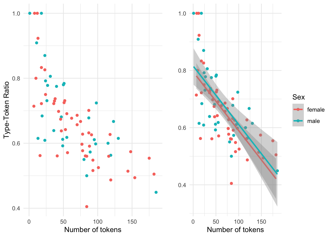
Figure 3.8: Scatterplot visualizing the relationship between num\_tokens and ttr.
In this multivariate case, the scatterplot without the trend line is more difficult to interpret. The trend lines for the levels of sex help visually understand the variation of the relationship of num_tokensand ttr much better. But it is important to note that when there are multiple trend lines there is more than one slope to evaluate. The correlation coefficient can be calculated for each level of sex (i.e. ‘male’ and ‘female’) independently but the relationship between the each slope can be visually inspected and provide important information regarding each level’s relative distribution. If the trend lines are parallel (ignoring the ribbons for the moment), as it appears in this case, this suggests that the relationship between the continuous variables is stable across the levels of the categorical variable, with males showing more lexical diversity than females declining at a similar rate. If the lines were to cross, or suggest that they would cross at some point, then there would be a potentially important difference between the levels of the categorical variable (known as an interaction). Now let’s consider the meaning of the ribbons. Since the ribbons reflect the range in which the real trend line could fall, and these ribbons overlap, the differences between the levels of our categorical variable are likely not distinct. So at a descriptive level, this visual summary would suggest that there are no differences between the relationship between num_tokens and ttr for the distinct levels of sex.
Characterizing the relationship between two continuous variables, as we have seen is either performed through a correlation coefficient metric or visually. The approach for summarizing a bivariate relationship which combines a continuous and categorical variable is distinct. Since a categorical variable is by definition a class-oriented variable, a descriptive evaluation can include a tabular representation, with some type of summary statistic. For example, if we consider the relationship between num_tokens and age_group we can calculate the mean for num_tokens for each level of age_group. To provide a metric of dispersion we can include either the standard error of the mean (SEM) and/ or the confidence interval (CI).
In Table 3.3 we see each of these summary statistics.
| age_group | mean_num_tokens | sem | ci |
|---|---|---|---|
| 10-year-olds | 27.8 | 3.69 | 6.07 |
| 12-year-olds | 57.4 | 7.12 | 11.71 |
| 16-year-olds | 81.7 | 6.15 | 10.11 |
| 17-year-olds | 112.4 | 12.98 | 21.35 |
The SEM is a metric which summarizes variation based on the number of values and the CI, as we have seen, summarizes the potential range of in which the mean may fall given a likelihood criterion (usually the same as the \(p\)-value, .05).
Because we are assessing a categorical variable in combination with a continuous variable a table is an available visual summary. But as I have said before, a graphic summary is hard to beat. In the following figure (3.9) a barplot is provided which includes the means of num_tokens for each level of age_group. The overlaid bars represent the confidence interval for each mean score.
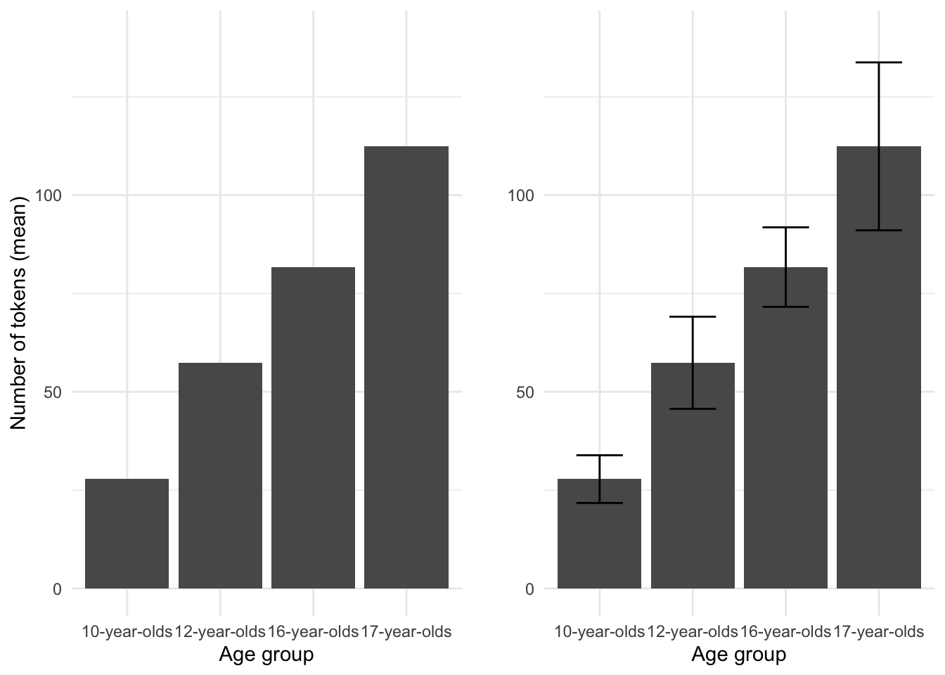
Figure 3.9: Barplot comparing the mean num\_tokens by age\_group from the BELC dataset.
When CI ranges overlap, just as with ribbons in scatterplots, the likelihood that the differences between levels are ‘real’ is diminished.
To gauge the effect size of this relationship we can use Spearman’s rho for rank-based coefficients. The score is 0.708 indicating that the relationship between age_group and num_tokens is quite strong. 9
Now, if we want to explore a multivariate relationship and add sex to the current descriptive summary, we can create a summary table, but let’s jump straight to a barplot.
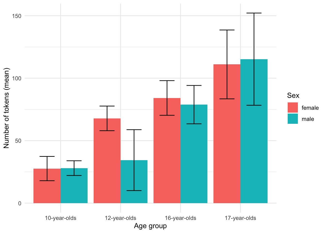
Figure 3.10: Barplot comparing the mean num_tokens by age_group and sex from the BELC dataset.
We see in Figure 3.10 that on the whole, the appears to be general trend towards more tokens in a composition for more advanced learner levels. However, the non-overlap in CI bars for the ‘12-year-olds’ for the levels of sex (‘male’ and ‘female’) suggest that 12-year-old females may produce more tokens per composition than males –a potential divergence from the overall trend.
Barplots are a familiar and common visualization for summaries of continuous variables across levels of categorical variables, but a boxplot is another useful visualization of this type of relationship.
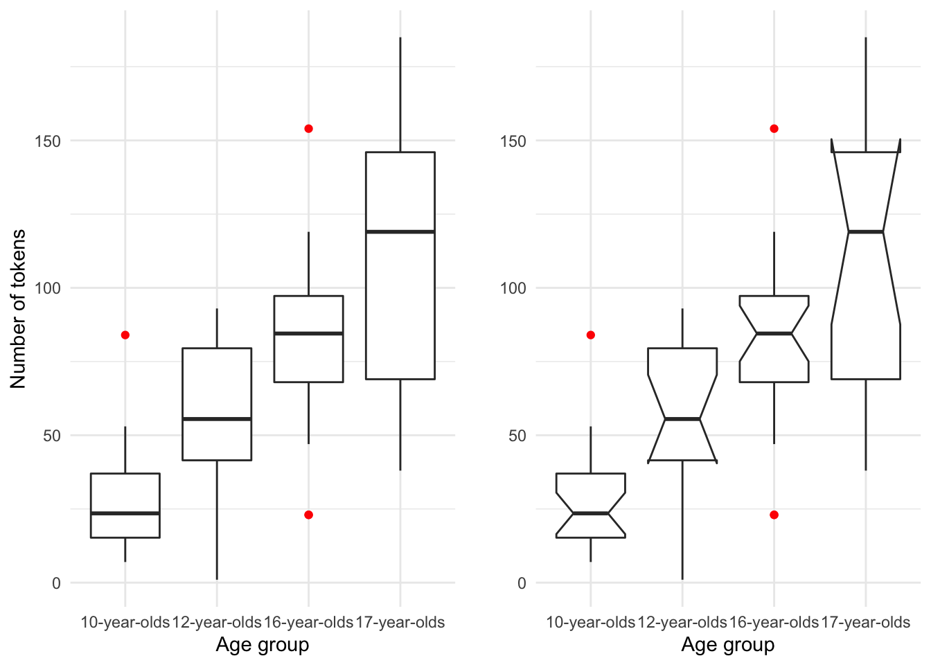
Figure 3.11: Boxplot of the relationship between age_group and num_tokens from the BELC dataset.
As seen when summarizing single continuous variables, boxplots provide a rich set of information concerning the distribution of a continuous variable. In this case we can visually compare the continuous variable num_tokens with the categorical variable age_group. The plot in the right pane includes ‘notches’. Notches represent the confidence interval, in boxplots this interval surrounds the median. When compared horizontally across levels of a categorical variable the overlap of notched spaces suggest that the true median may be within the same range.
Additionally, when the confidence interval goes outside the interquantile range (the box) the notches hinge back to the either the 1st (lower) or the 3rd (higher) IQR range and suggests that the variability is high.
We can also add a third variable to our exploration. As in the barplot in Figure 3.10, the boxplot in Figure 3.12 suggests that there is an overall trend towards more tokens per composition as a learner advances in experience, except at the ‘12-year-old’ level where there appears to be a difference between ‘males’ and ‘females’.
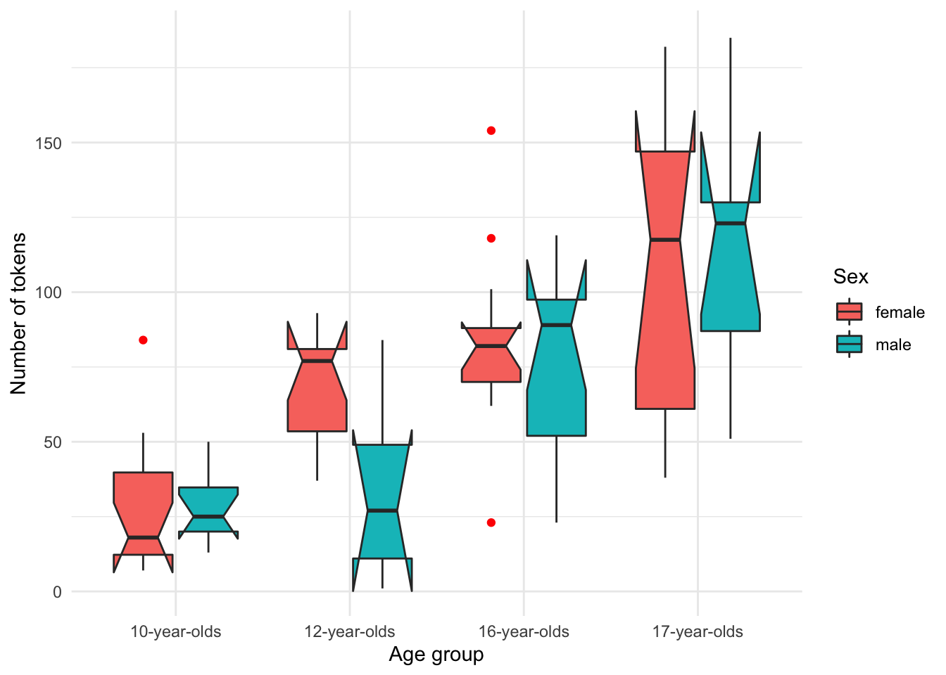
Figure 3.12: Boxplot of the relationship between age_group, num_tokens and sex from the BELC dataset.
Up to this point in our exploration of multiple variables we have always included at least one continuous variable. The central tendency for continuous variables can be summarized in multiple ways (mean, median, and mode) and when calculating means and medians, measures of dispersion are also provide helpful information summarize variability. When working with categorical variables, however, measures of central tendency and dispersion are more limited. For ordinal variables central tendency can be summarized by the median or mode and dispersion can be assessed with an interquantile range. For nominal variables the mode is the only measure of central tendency and dispersion is not applicable. For this reason relationships between categorical variables are typically summarized using contingency tables which provide cross-variable counts for each level of the target categorical variables.
Let’s explore the relationship between the categorical variables sex and age_group. In Table 3.4 we see the contingency table with summary counts and percentages.
| sex/age_group | 10-year-olds | 12-year-olds | 16-year-olds | 17-year-olds | Total |
|---|---|---|---|---|---|
| female | 58% (14) | 69% (11) | 54% (13) | 67% (10) | 61% (48) |
| male | 42% (10) | 31% (5) | 46% (11) | 33% (5) | 39% (31) |
| Total | 100% (24) | 100% (16) | 100% (24) | 100% (15) | 100% (79) |
As the size of the contingency table increases, visual inspection becomes more difficult. As we have seen, a graphical summary often proves more helpful to detect patterns.
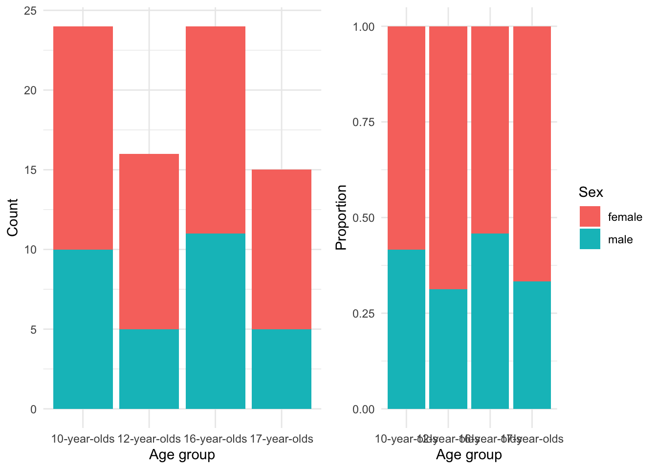
Figure 3.13: Barplot…
In Figure 3.13 the left pane shows the counts. Counts alone can be tricky to evaluate and adjusting the barplot to account for the proportions of males to females in each group, as shown in the right pane, provides a clearer picture of the relationship. From these barplots we can see there were more females in the study overall and particularly in the 12-year-olds and 17-year-olds groups. To gauge the association strength between sex and age_group we can calculate Cramer’s V which, in spirit, is like our correlation coefficients for the relationship between continuous variables. The Cramer’s V score for this relationship is 0.12 which is low, suggesting that there is not a strong association between sex and age_group –in other words, the relationship is stable.
Let’s look at a more complex case in which we have three categorical variables. Now the dataset, as is, does not have a third categorical variable for us to explore but we can recast the continuous num_tokens variable as a categorical variable if we bin the scores into groups. I’ve binned tokens into three score groups with equal ranges in a new variable called rank_tokens.
Adding a second categorical independent variable ups the complexity of our analysis and as a result our visualization strategy will change. Our numerical summary will include individual two-way cross-tabulations for each of the levels for the third variable. In this case it is often best to use the variable with the fewest levels as the third variable, in this case sex.
| rank_tokens/age_group | 10-year-olds | 12-year-olds | 16-year-olds | 17-year-olds | Total |
|---|---|---|---|---|---|
| low | 27% (13) | 10% (5) | 4% (2) | 6% (3) | 48% (23) |
| mid | 2% (1) | 13% (6) | 21% (10) | 6% (3) | 42% (20) |
| high | 0% (0) | 0% (0) | 2% (1) | 8% (4) | 10% (5) |
| Total | 29% (14) | 23% (11) | 27% (13) | 21% (10) | 100% (48) |
| rank_tokens/age_group | 10-year-olds | 12-year-olds | 16-year-olds | 17-year-olds | Total |
|---|---|---|---|---|---|
| low | 32% (10) | 13% (4) | 13% (4) | 3% (1) | 61% (19) |
| mid | 0% (0) | 3% (1) | 23% (7) | 6% (2) | 32% (10) |
| high | 0% (0) | 0% (0) | 0% (0) | 6% (2) | 6% (2) |
| Total | 32% (10) | 16% (5) | 35% (11) | 16% (5) | 100% (31) |
Contingency tables with this many levels are notoriously difficult to interpret. A plot that is often used for three-way contingency table summaries is a mosaic plot. In Figure 3.14 I have created a mosaic plot for the three categorical variables in the previous contingency tables.
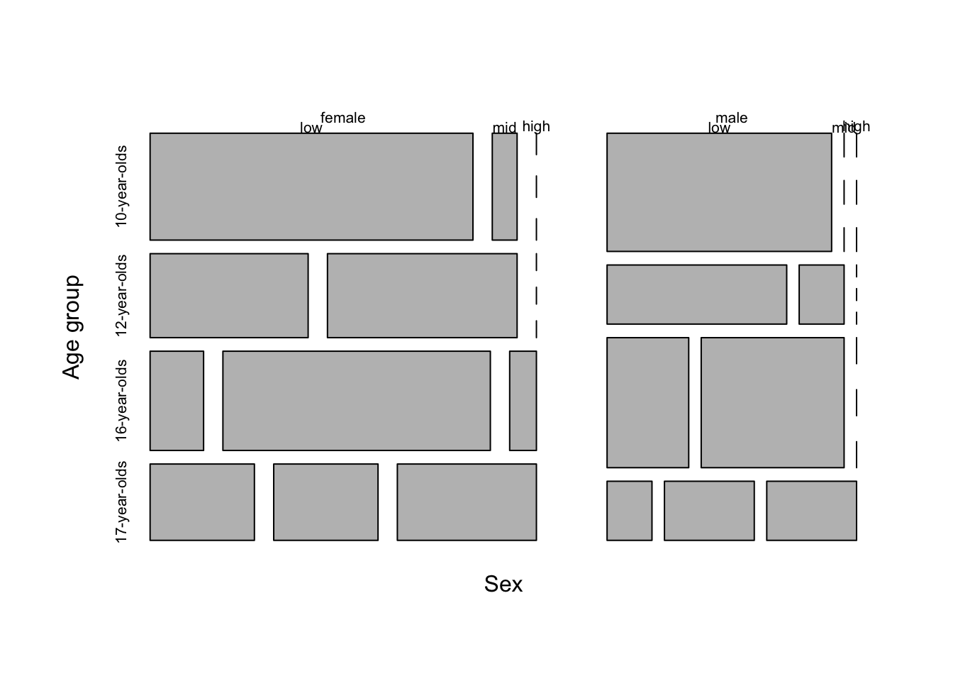
Figure 3.14: Mosaic plot for three categorical variables age_group, rank_tokens, and sex in the BELC dataset.
The mosaic plot suggests that the number of tokens per composition increase as the learner age group increases and that females show more tokens earlier.
In sum, a dataset is information but when the observations become numerous or complex they are visually difficult to inspect and understand at a pattern level. The descriptive methods described in this section are indispensable for providing the researcher an overview of the nature of each variable and any (potential) relationships between variables in a dataset. Importantly, the understanding derived from this exploration underlies all subsequent investigation and will counted on to frame your approach to analysis regardless of the research goals and the methods employed to derive more substantial knowledge.
3.2 Analysis
From identifying a target population, to selecting a data sample that represents that population, and then to structuring the sample into a dataset, the goals of a research project inform and frame the process. So it will be unsurprising to know that the process of selecting an approach to analysis is also intimately linked with a researcher’s objectives. The goal of analysis, generally, is to generate knowledge from information. The type of knowledge generated and the process by which it is generated, however, differ and can be broadly grouped into three analysis types: inferential, predictive, and exploratory. In this section I will provide an overview of how each of these analysis types are tied to research goals and how the general goals of teach type affect: (1) how to identify the variables of interest, (2) how to interrogate these variables, and (3) how to interpret the results. I will structure the discussion of these analysis types moving from the most structured (deductive) to least structured (inductive) approach to deriving knowledge from information with the aim to provide enough information to the would-be-researcher to identify these research approaches in the literature and to make appropriate decisions as to which approach their research should adopt.
3.2.1 Inferential data analysis
The most commonly recognized of the three data analysis approaches, inferential data analysis (IDA) is the bread-and-butter of science. IDA is a deductive, or top-down, approach to investigation in which every step in research stems from a premise, or hypothesis, about the nature of a relationship in the world and then aims to test whether this relationship is statistically supported given the evidence. The aim is to infer conclusions about a certain relationship in the population based on a statistical evaluation of a (corpus) sample. So, if a researcher’s aim is to draw conclusions that generalize, then, this is the analysis approach a researcher will take.
Given the fact that this approach aims at making claims that can be generalized to the larger population, the IDA approach has the most rigorous set of methodological restrictions. First and foremost of these is the fact that a testable hypothesis must be formulated before research begins. The hypothesis guides the collection of data, the organization of the data into a dataset and the transformation, selection of the variables to be used to address the hypothesis, and the interpretation of the results. To conduct an analysis and then draw a hypothesis which conforms to the results is known as “Hypothesis After Result is Known” (HARKing) (Kerr, 1998) and this practice violates the principles of significance testing. A second key stipulation is that the reliability of the sample data, the corpus in text analysis, to provide evidence to test the hypothesis must be representative of the population. A corpus used in a study which is misaligned with the hypothesis undermines the ability of the researcher to make valid claims about the population. In essence, IDA is only as good as the primary data is is based on.
At this point, let me elaborate on the potentially counterintuitive nature of hypothesis formulation and testing. The IDA, or Null-Hypothesis Significance Testing (NHST), paradigm is in fact approached by proposing two mutually exclusive hypotheses. The first is the Alternative Hypothesis (\(H_1\)). \(H_1\) is a precise statement grounded in the previous literature outlining a predicted relationship (and in some cases the directionality of a relationship). This is the effect that the research aims to investigate. The second hypothesis is the Null Hypothesis (\(H_0\)). \(H_0\) is the flip-side of the hypothesis testing coin and states that there is no difference or relationship. Together \(H_1\) and \(H_0\) cover all logical outcomes.
So to provide an example consider a hypothetical study which is aimed at investigating the claim that men and women differ in terms of the number of questions they use in spontaneous conversations. The Alternative Hypothesis would be formulated in this way:
\(H_1\): Men and women differ in the frequency of the use of questions in spontaneous conversations.
The Null Hypothesis, then, would be a statement describing the remaining logical outcomes. Formally:
\(H_0\): There is no difference between how men and women use questions in spontaneous conversations.
Note that stated in this way our hypothesis makes no prediction about the directionality of the difference between men and women, only that there is a difference. It is a likely scenario that a hypothesis will stake a claim on the direction of the difference. A directional hypothesis would look like this:
\(H_1\): Women use more questions than men in spontaneous conversations.
\(H_0\): There is no difference between how men and women use questions in spontaneous conversations or men use more questions than women.
A further aspect which may run counter to expectations is that the aim of hypothesis testing is not to find evidence in support of \(H_1\), but rather the aim is to assess the likelihood that we can reliably reject \(H_0\). The default assumption is that \(H_0\) is true until there is sufficient evidence to reject it and accept \(H_1\), the alternative. The metric used to determine if there is sufficient evidence is based on the probability that given the nature of the relationship and the characteristics of the data, the likelihood of there being no difference or relationship is low. The threshold for likelihood has traditionally been summarized in the p-value statistic. In the Social Sciences, a p-value lower that .05 is considered statistically significant which when interpreted correctly means that there is more than a 95% chance that the observed relationship would not be predicted by \(H_0\). Note that we are working in the realm of probability, not in absolutes, therefore an analysis that produces a significant result does not prove \(H_1\) is correct or that \(H_0\) is incorrect, for that matter. A margin of error is always present.
Let’s now turn to the identification of variables, the statistical interrogation of these variables, and the interpretation of the statistical results. First, since a clearly defined and testable hypothesis is at the center of the IDA approach, the variables are in some sense pre-defined. The goal of the researcher is to select data and curate that data to produce variables that are operationalized (practically measured) to test the hypothesis. A second consideration are the roles that the variables will play in the analysis. In standard IDA one variable will be the dependent variable and one or more variables will be independent variables. The dependent variable, sometimes referred to as the outcome or response variable, is the variable which contains the information which is predicted to depend on the information in the independent variable(s). It is the variable whose variation a research study seeks to explain. An independent variable, sometimes referred to as a predictor or explanatory variable, is a variable whose variation is predicted to explain the variation in the dependent variable.
Returning to our hypothetical study on the use of questions between men and women in spontaneous conversation, the frequency of questions used by each speaker would be our dependent variable and the biological sex of the speakers our independent variable. This is so because hypothesis (\(H_1\)) states the proposition that a speaker’s sex will predict the frequency of questions used.
In our hypothetical study we’ve identified two variables, one dependent and one independent. It is important keep in mind that there can be multiple independent variables in cases where the dependent variable’s variation is predicted to be related to multiple variables. This relationship would need to be explicitly part of the original hypothesis, however.
Say we formulate a more complex relationship where the educational level of our speakers is also related to the number of questions. We can update our hypothesis to reflect such a scenario.
\(H_1\): Less educated women use more questions than men in spontaneous conversations.
\(H_0\): There is no difference between how men and women use questions in spontaneous conversations regardless of educational level, or more educated women use more questions than less educated women, or men use more questions than women.
The hypothesis we have described predicts what is known as an interaction; the relationship between our independent variables predict different variational patterns in the dependent variable. As you most likely can appreciate the more independent variables we include in our hypothesis, and by extension our analysis, the more difficult it becomes to interpret. Due to the increasing difficulty for interpretation, in practice, IDA studies rarely include more than two or three independent variables in the same analysis.
Independent variables add to the complexity of a study because they are part of our research focus, specifically our hypothesis. It is, however, common to include other variables which are not of central focus, but are commonly assumed to contribute to the explanation of the variation of the dependent variable. Let’s assume that the background literature suggests that the age of speakers also plays a role in the number of questions that men and women use in spontaneous conversation. Let’s also assume that the data we have collected includes information about the age of speakers. If we would like to factor out the potential influence of age on the use of questions and focus on the particular independent variables we’ve defined in our hypothesis, we can include the age of speakers as a control variable. A control variable will be added to the statistical analysis and documented in our report but it will not be included in the hypothesis nor interpreted in our results.
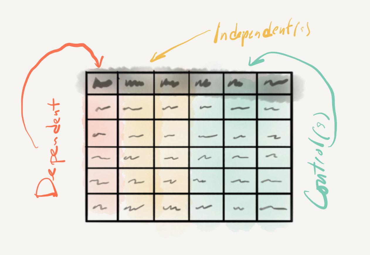
Figure 3.15: Variable roles in inferential analysis.
At this point let’s look at the main characteristics that need to be taken into account to statistically interrogate the variables we have chosen to test our hypothesis. The type of statistical test that one chooses is based on (1) the informational value of the dependent variable and (2) the number of independent variables included in the analysis. Together these two characteristics go a long way in determining the appropriate class of statistical test, but other considerations about the distribution of particular variables (i.e. normality), relationships between variables (i.e. independence), and expected directionality of the predicted effect may condition the appropriate method to be applied.
As you can imagine, there are a host of combinations and statistical tests that apply in particular scenarios, too many to consider in given the scope of this coursebook (see Gries (2013) and Paquot & Gries (2020) for a more exhaustive description). Below I’ve summarized some common statistical scenarios and their associated tests which focus on the juxtaposition of informational values and the number of variables, leaving aside alternative tests which deal with non-normal distributions, ordinal variables, non-independent variables, etc.
In Table 3.7 we see monofactorial tests, tests with only one independent variable.
| Dependent | Independent | Test |
|---|---|---|
| Categorical | Categorical | Pearson’s Chi-squared test |
| Continuous | Categorical | Student’s t-Test |
| Continuous | Continuous | Pearson’s correlation test |
Table 3.8 includes a listing of multifactorial tests, tests with more than one independent and/ or control variables.
| Dependent | Independent | Control | Test |
|---|---|---|---|
| Categorical | varied | varied | Logistic regression |
| Continuous | varied | varied | Linear regression |
One key point to make before we turn to how to interpret the statistical results is concerns the use of the data in IDA. In contrast to the other two analysis methods we will cover, the data in IDA is only used once. That is to say, that the entire dataset is used a single time to statistically interrogate the relationship(s) of interest. The resulting confidence metrics (p-values, etc.) are evaluated and the findings are interpreted. The practice of running multiple tests until a statistically significant result is found is called “p-hacking” (Head, Holman, Lanfear, Kahn, & Jennions, 2015) and like HARKing (described earlier) violates statistical hypothesis testing practice. For this reason it is vital to identify your statistical approach from the outset of your research project.
Now let’s consider how to approach interpreting the results from a statistical test. As I have now made reference to multiple times, the results of statistical procedure in hypothesis testing will result in a confidence metric. The most standard and widely used of these confidence metrics is the p-value. The p-value provides a probability that the results of our statistical test could be explained by the null hypothesis. When this probability crosses below the threshold of .05, the result is considered statistically significant, otherwise we have a ‘null result’ (i.e. non-significant). However, this sets up a binary distinction that can be problematic. On the one hand what is one to do if a test returns a p-value of .051 or something ‘marginally significant’? According to standard practice these results would not be statistically significant. But it is important to note that a p-value is sensitive to the sample size. A small sample may return a non-significant result, but a larger sample size with the same underlying characteristics may very well return a significant result. On the other hand, if we get a statistically significant result, do we move on –case closed? As I just pointed out the sample size plays a role in finding statistically significant results, but that does not mean that the results are ‘important’ for even small effects in large samples can return a significant p-value.
It is important to underscore that the purpose of IDA is to draw conclusions from a dataset which are generalizable to the population. These conclusions require that there are rigorous measures to ensure that the results of the analysis do not overgeneralize (suggest there is a relationship when there is not one) and balance that with the fact that we don’t want to undergeneralize (miss the fact that there is an relationship in the population, but our analysis was not capable of detecting it). Overgeneralization is known as Type I error or false positive and undergeneralization is a Type II error or false negative.
For these reasons it is important to calculate the size and magnitude of the result to gauge the uncertainty of our result in standardized, sample size-independent way. This is performed by analyzing the effect size and reporting a confidence interval (CI) for the results. The wider the CI the more uncertainty surrounds our statistical result, and therefore the more likely that our significant p-value could be the result of Type I error. A non-significant p-value and large effect size could be the result of Type II error. In addition to vetting our p-value, the CI and effect size can help determine if a significant result is reliable and ‘important’. Together effect size and CIs aid in our ability to realistically interpret confidence metrics in statistical hypothesis testing.
3.2.2 Predictive data analysis
Predictive data analysis (PDA) is the first of the two types of statistical approaches we will cover that fall under machine learning. A branch of artificial intelligence (AI), machine learning aims to develop computer algorithms that can essentially learn patterns from data automatically. In the case of PDA, also known as supervised learning, the learning process is guided (supervised) by directing an algorithm to associate patterns in a variable or set of variables to single particular variable. The particular variable is analogous to some degree to a dependent variable in IDA, but in the machine learning literature this variable is known as the target variable. The other variable or (more often than not) variables are known as features. The goal of PDA is to develop a statistical generalization that can accurately predict the values of a target variable using the values of the feature variables. PDA can be seen as a mix of deductive (top-down) and inductive (bottom-up) methods in that the target variable is determined by a research goal but the feature variables and choice of statistical method (algorithm) are not fixed and can vary depending on their usefulness in effectively predicting the target variable. PDA is a versatile method that often employed to derive intelligent action from data, but it can also be used for hypothesis generation and even hypothesis testing, under certain conditions. If a researcher’s aim is to create model that can perform a language related task, explore association strength between a target variable and various types and combinations of features, or to perform emerging alternative approaches to hypothesis testing 10, this is the analysis approach a researcher will take.
At this point let’s consider some departures from the inferential data analysis (IDA) approach we covered in the last subsection that are important to highlight to orient our overview of PDA. First, while the cornerstone of IDA is the hypothesis, in PDA this is typically not the case. A research question which identifies a source of potential uncertainty in an area and outlines a strategy for addressing this uncertainty is sufficient groundwork to embark on an analysis. A second divergence, is the fact that the data is used in a very distinct way. In IDA the entire dataset is statistically interrogated once and only once. In PDA the dataset is (minimally) partitioned into a training set and a test set. The training set is used to train a statistical model and the test set is left to test the accuracy of the statistical model. The training set typically constitutes a larger portion of the data (typically around 75%) and serves as the test bed for iteratively applying one or more algorithms and/ or feature combinations to produce the most successful learning model. The test set is reserved for a final evaluation of the model’s performance. Depending on the application and the amount of available data, a third development set is sometimes created as a pseudo test set to facilitate the testing of multiple approaches on data outside the training set before the final evaluation on the test set is performed. In this scenario the proportions of the partitions vary, but a good rule of thumb is to reserve 60% of the data for training, 20% for development, and 20% for testing.
Let’s now turn to the identification of variables, the statistical interrogation of these variables, and the interpretation of the statistical results. In IDA the variables (features) are pre-determined by the hypothesis and the informational values and number of these variables plays a significant role in selecting a statistical procedure (algorithm). Lacking a hypothesis, a PDA approach’s main goal is to make accurate predictions on the target variable and is free to explore any number of features and feature combinations to that end. The target variable is the only variable which necessarily fixed and in this light pre-determined.
To give an example, let’s consider a language task in which the goal is to take text messages (SMS) and develop a language model that predict if a message is spam or not. Minimally we would need data which includes individual text messages and each of these text message will need to be labeled as being either spam or legitimate messages (‘ham’ in this case). In Table 3.9 we see the first ten of 4837 observations from the SMS Spam Collection (v.1) dataset collected by Almeida, G’omez Hildago, & Yamakami (2011).
| sms_type | message |
|---|---|
| ham | Go until jurong point, crazy.. Available only in bugis n great world la e buffet… Cine there got amore wat… |
| ham | Ok lar… Joking wif u oni… |
| spam | Free entry in 2 a wkly comp to win FA Cup final tkts 21st May 2005. Text FA to 87121 to receive entry question(std txt rate)T&C’s apply 08452810075over18’s |
| ham | U dun say so early hor… U c already then say… |
| ham | Nah I don’t think he goes to usf, he lives around here though |
| spam | FreeMsg Hey there darling it’s been 3 week’s now and no word back! I’d like some fun you up for it still? Tb ok! XxX std chgs to send, £1.50 to rcv |
| ham | Even my brother is not like to speak with me. They treat me like aids patent. |
| ham | As per your request ‘Melle Melle (Oru Minnaminunginte Nurungu Vettam)’ has been set as your callertune for all Callers. Press *9 to copy your friends Callertune |
| spam | WINNER!! As a valued network customer you have been selected to receivea £900 prize reward! To claim call 09061701461. Claim code KL341. Valid 12 hours only. |
| spam | Had your mobile 11 months or more? U R entitled to Update to the latest colour mobiles with camera for Free! Call The Mobile Update Co FREE on 08002986030 |
As it stands we have two variables; sms_type is clearly the target and message contain the full messages. The question is how best to transform the information in the message variable such that it will provide an algorithm useful information to predict each value of sms_type. Since the informational value of sms_type is categorical we will call the values classes. The process of deciding on how to transform the information in message into useful features is called feature engineering and it is a process which is much an art as a science. On the creative side of things it is often helpful to have a mixture of relevant domain knowledge and clever hacking skills to envision what features may work best. The more logistic side of things requires some knowledge about the strengths and weaknesses of various learning algorithms when dealing with certain number and informational value feature combinations.
Leaving the choice of algorithm aside, let’s focus on feature engineering. Since each message value is a unique message, the chance that using message as it is, is not likely to help us make reliable predictions about the status of new message (‘spam’ or ‘ham’). A simple first-pass approach to decomposing message to draw out similarities and distinctions between the classes may be to break each message into words. Now SMS messages are not your average type of text –there are many non-standard forms. So our definition of word may simply be character groupings broken apart by whitespace. To avoid confusion between our common-sense understanding of word and the types of character strings, it is often the case that language feature values are called terms. Other term types may work better, n-grams, character sequences, stems/lemmas, or even combinations of these. Certain terms may be removed that are potentially uninformative either based on their class (stopwords, numerals, punctuation, etc.) or due to their distribution. The process of systematic isolation of terms which are more informative than others is called dimensionality reduction (Kowsari et al., 2019). With experience a research will become more adept a recognizing advantages and potential issues and alternative ways of approaching the creation of features but there is almost always some level of trial and error in the process. Feature engineering is very much an exploratory process. It is also iterative. You can try a set of features with an algorithm and produce a language model and test it on the training set –if is accurate, great. If not, you can brainstorm some more –you are free to try further engineer the features trying new features or feature measures (term weights) and/ or change the learning algorithm.
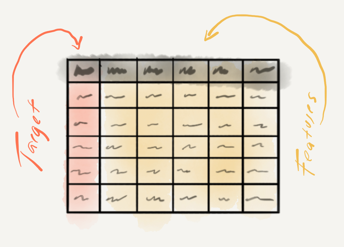
Figure 3.16: Variable roles in predictive analysis.
Let’s now turn to some considerations to take into account when selecting a statistical algorithm. First, just as in IDA, variable informational value plays a role in algorithm selection, specifically the informational value of the target variable. If the target variable is categorical, then we are looking for a classification algorithm. If the target variable is continuous, we will employ a regression algorithm. 11 Some common classification algorithms are listed in Table 3.10.
| Classification | Regression |
|---|---|
| Logistic Regression | Linear Regression |
| Support Vector Machine | Support Vector Regression |
| Naïve Bayes Classifier | Poisson Regression |
| Neural Network | |
| Decision Tree |
Another consideration to take into account is the whether the researcher aims to go beyond simply using an algorithm to make accurate predictions, but also wants to understand how the algorithm made its predictions and what contribution features made in the process. There are algorithms that produce models that allow the researcher to peer into and understand its inner workings (e.g. logistic regression, naïve bayes classifiers, inter alia) and those that do not (e.g. neural networks, support vector machines, inter alia). Those that do not are called ‘black-box’ algorithms. Neither type assures the best prediction accuracy. Important trade-offs need to be considered, however, if the best prediction comes from a black-box method, but the goal of the research is to understand the contribution of the features to the model’s predictions.
Once we have identified our target variable, engineered a promising set of features, and selected an algorithm to employ that meets our research goals, it is now time to interrogate the dataset. The first step is to partition the dataset into a training and test set. The training set is the dataset we will use to try out different features and/ or algorithms with the aim of developing a model which can most accurately predict the target variable values in this training set. This is the second step and it’s done by first training an algorithm to associate the features with the (actual) target values. Next, the resulting model is then applied to the same training data, yet with the target variable removed, or hidden, from the machine learner. The target values predicted by the model for each observation are compared to the actual target values. The more predicted and actual values for the target variable coincide, the more accurate the model. If the model shows high accuracy, then we are ready to move to evaluate this model on the test set (again removing the target variable). If the model accuracy is low, it’s back to the drawing board either returning to feature engineering and/ or algorithm selection in hopes to improve model performance. In this way, the training data can be used multiple times, a clear divergence from standard IDA methods in which the data is interrogated and analyzed once and only once.
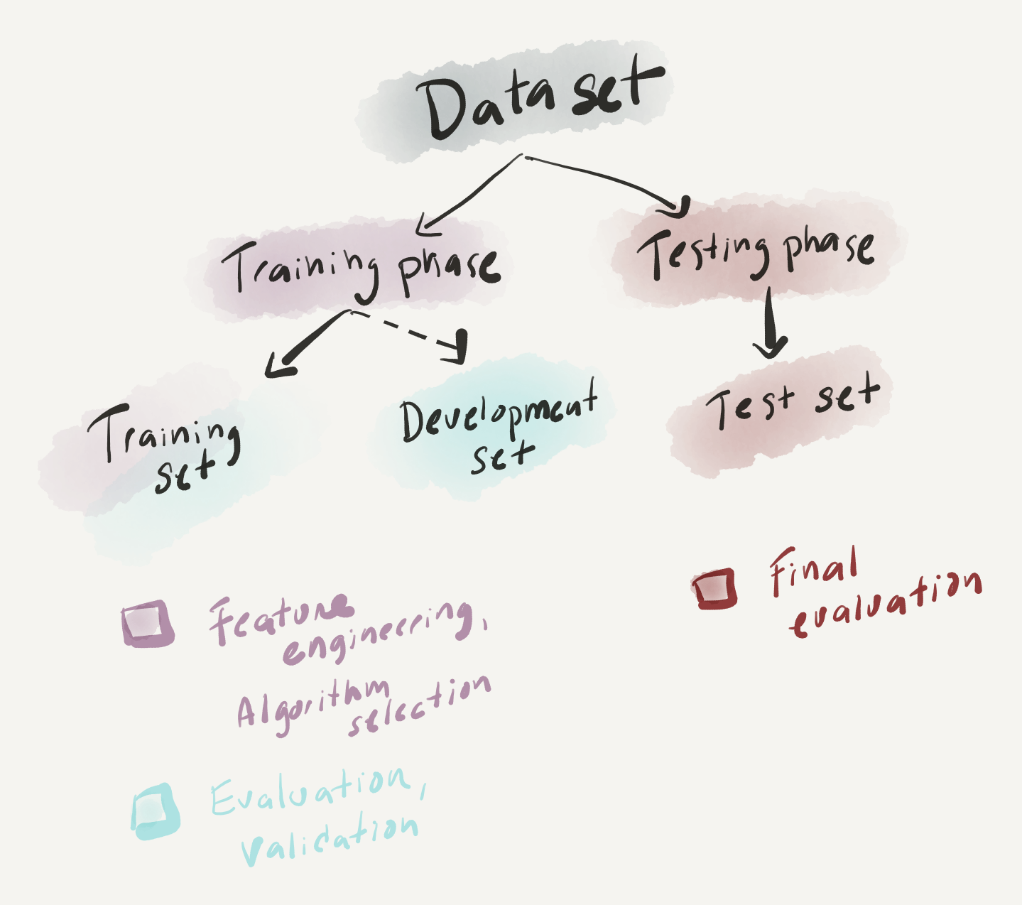
Figure 3.17: Phases in predictive analysis.
For all applications of PDA the interpretation of the prediction model includes some metric or metrics of accuracy comparing the extent to which the models predictions and the actual targets align. In cases in which the inner workings of the model are of interest, a researcher can dive into features and their contributions to the prediction model in an exploratory fashion according to the research goals. The exploration of features, then, varies, so at this time let’s focus on the metrics of prediction accuracy.
The standard form for evaluating a model’s performance differs between classification models (naive bayes) and regression models (linear regression). For classification models, a cross-tabulation of the predicted and actual classes results in a contingency table which can be used to calculate accuracy which is the sum of all the correctly predicted observations divided by the total number of observations in the test set. In addition to accuracy, there are various other measures which aim to assess a model’s performance to gain more insight into the potential over- or under-generalization of the model (Precision and Recall). For regression models, differences between predicted and actual values can be assessed using a coefficient of correlation (typically \(R^2\)). Again, more fine-grained detail about the model’s performance can be calculated (Root Mean Square Error).
Another component worthy of consideration when evaluating a model’s performance is how do we determine if the performance is actually good. One the one hand, accuracy rates into the 90+% range on the test set is usually a good sign that the model is performing well. No model will perform with perfect accuracy, however, and depending on the goal of the research particular error patterns may be more important, and problematic, than the overall prediction accuracy. On the other hand, another eventuality is that the model performs very well on the training set but that on the test set (new data) the performance drops significantly. This is a sign that during the training phrase the machine learning algorithm learned nuances in the data (‘noise’) that obscure the signal pattern to be learned. This problem is called overfitting and to avoid it researchers iteratively run evaluations of the training data using resampling. The two most common resampling methods are bootstrapping (resampling with replacement) and cross-validation (resampling without replacement). The performance of these multiple models are summarized and the error between them is assessed. The goal is to minimize the performance differences between the models while maximizing the overall performance. These measures go a long way to avoiding overfitting and therefore maximizing the chance that the training phase will produce a model which is robust.
3.2.3 Exploratory data analysis
The last of the three analysis types, exploratory data analysis (EDA) includes a wide range of methods whose objective is to identify structure in datasets using only the data itself. In this way, EDA is an inductive, bottom-up approach to data analysis, which does not make any formal assumptions about the relationship(s) between variables. EDA can be roughly broken into two subgroups of analysis. Unsupervised learning, like supervised learning (PDA), is a subtype of machine learning. However, unlike prediction, unsupervised learning does not include a target variable to guide associations. The second subgroup of EDA methods can be seen as a (more robust) extension of the descriptive analysis methods covered earlier in this chapter. Either through unsupervised learning or descriptive methods, EDA employs quantitative methods to summarize, reduce, and sort complex datasets and statistically and visually interrogate a dataset in order to provide the researcher novel perspective to be qualitatively assessed. These qualitative assessments may prove useful to generate hypotheses or to generate groupings to be used in predictive analyses. So, if a researcher’s aim is to probe a dataset in order to explore potential relationships in an area where predictions and/ or hypotheses cannot be clearly made, this is the analysis approach to choose.
In contrast to both IDA and even PDA in which there are assumptions made about what relationship(s) to explore, EDA makes no such assumptions. Furthermore, given the exploratory nature of the process, EDA is not an approach which can in itself be used to make conclusive generalizations about the populations from which the (corpus) sample in which it is drawn. For IDA the fidelity of the sample and the process of selection of the variables is of utmost importance to ensure that the statistical results are reliably generalizable. Even in the case of PDA, the sample and variables selected are key to building a robust predictive model. However, in contrast to IDA, but similar to PDA, EDA methods may reuse the data selecting different variables and/or methods as research goals dictate. If a machine learning approach to EDA is adopted, the dataset can be partitioned into training and test sets, in a similar fashion to PDA. And as with PDA, the training set is used for refining statistical measures and the test set is used to evaluate the refined measures. Although the evaluation results still cannot be used to generalize, the insight can be taken as stronger evidence that there is a potential relationship, or set of relationships, worthy of further study.
Another notable point of contrast concerns the interpretation of EDA results. Although quantitative in nature, exploratory methods involve a high level of human interpretation. Human interpretation is a part of each stage of data analysis, and each statistical approach, in general, but exploratory methods produce results that require associative thinking and pattern detection which is distinct from the other two analysis approaches, in particular, IDA.
Again, as we have done for the other two analysis approaches, let’s turn to the process of variable identification, data interrogation, and interpretation methods. As in the case of PDA, EDA only requires a research goal. But in PDA, the research goal centered around predicting a target variable. In EDA, there is no such focus. The research goal may in fact be less defined and a researcher may consider various relationships in turn or simultaneously. The curation of the variables, however, does overlap in spirit to the process of feature engineering that we touched on for creating variables for predictive models. But in EDA the measure to gauge whether the engineered variables are good, is left to the qualitative evaluation of the researcher.
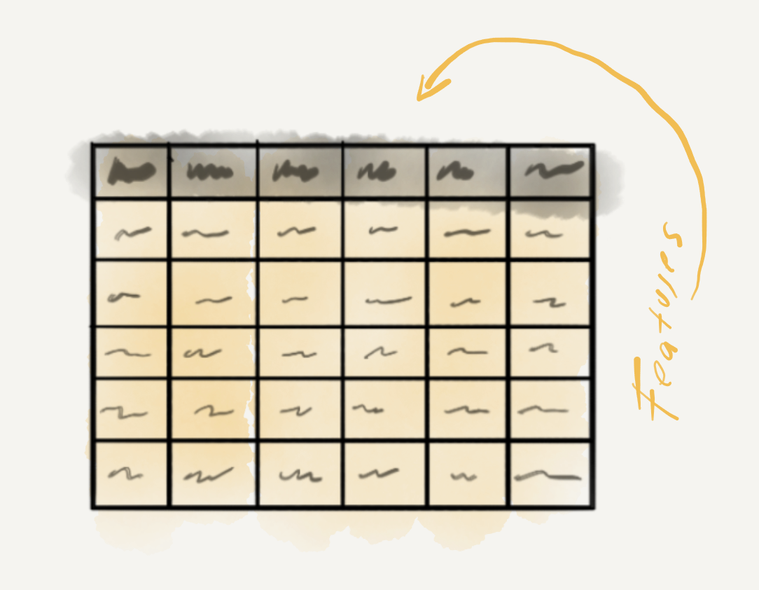
Figure 3.18: Variable roles in exploratory analysis.
For illustrative purposes let’s consider the State of the Union Corpus (SOTU) (Benoit, 2020). The presidential addresses and a set of meta-data variables are included in the corpus. I’ve subsetted this corpus to only include U.S. presidents since 1946. A tabular preview of the first 10 addresses (truncated for display) can be found in Table 3.11.
| president | date | delivery | party | addresses |
|---|---|---|---|---|
| Truman | 1946-01-21 | written | Democratic |
To the Congress of the United States: A quarte… |
| Truman | 1947-01-06 | spoken | Democratic | Mr. President, Mr. Speaker, Members of the Cong… |
| Truman | 1948-01-07 | spoken | Democratic | Mr. President, Mr. Speaker, and Members of the … |
| Truman | 1949-01-05 | spoken | Democratic | Mr. President, Mr. Speaker, Members of the Cong… |
| Truman | 1950-01-04 | spoken | Democratic | Mr. President, Mr. Speaker, Members of the Cong… |
| Truman | 1951-01-08 | spoken | Democratic | Mr. President, Mr. Speaker, Members of the Cong… |
| Truman | 1952-01-09 | spoken | Democratic | Mr. President, Mr. Speaker, Members of the Cong… |
| Truman | 1953-01-07 | written | Democratic |
To the Congress of the United States: I have t… |
| Eisenhower | 1953-02-02 | spoken | Republican | Mr. President, Mr. Speaker, Members of the Eigh… |
| Eisenhower | 1954-01-07 | spoken | Republican | Mr. President, Mr. Speaker, Members of the Eigh… |
A dataset such as this one could be leveraged to explore many different types of research questions. Key to guiding the engineering of features, however, is to clarify from the outset of the research project what the entity of study is, or unit of analysis. In IDA and PDA approaches, the unit of analysis forms an explicit part of the research hypothesis or goal. In EDA the research question may have multiple fronts, which may be reflected in differing units of analysis. For example, based on the SOTU dataset, we could be interested in political rhetoric, language of particular presidents, party ideology, etc. Depending on the perspective we are interested in investigating, the choice of how to approach engineering features to gain insight will vary.
By the same token, approaches for interrogating the dataset can vary widely, between and within the same research project, but for instructive purposes we can draw a distinction between descriptive methods and unsupervised learning methods.
| Descriptive | Unsupervised learning |
|---|---|
| Term frequency analysis | Cluster analysis |
| Term keyness analysis | Topic Modeling |
| Collocation analysis | Dimensionality reduction |
EDA leans heavily on visual representations of both descriptive and unsupervised learning methods. Visualizations enable humans to identify and extrapolate associative patterns. Visualizations range from standard barplots and scatterplots to network graphs and dendrograms and more. Some sample visualizations based on the SOTU Corpus are found in Figure 3.19.
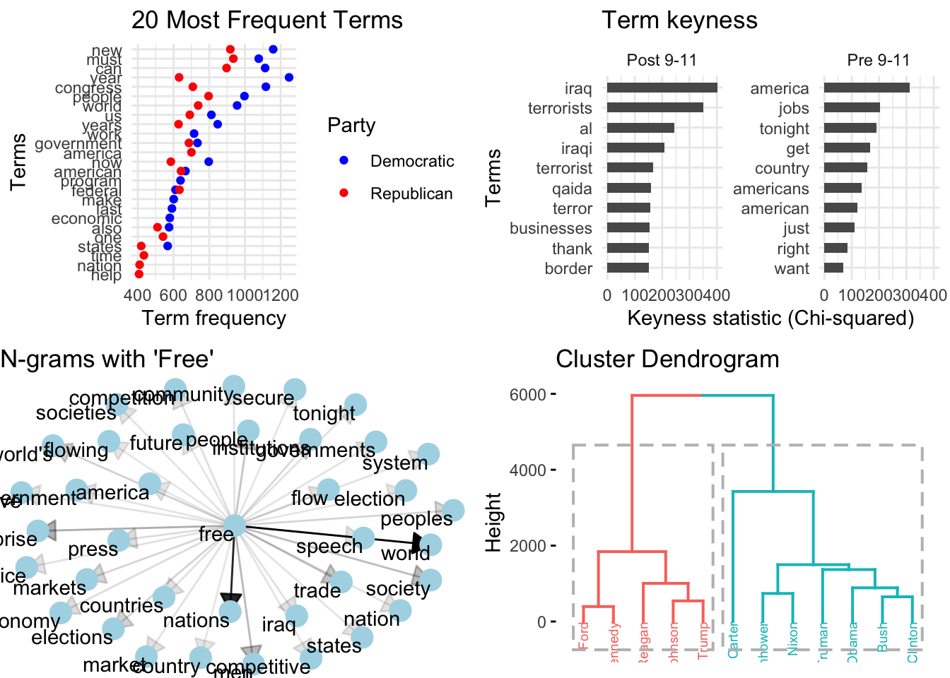
Figure 3.19: Sample visualizations from the SOTU Corpus (1946-2020).
Just as feature selection and analysis method, the interpretation of the results in EDA are much more varied than in the other analysis methods. EDA methods provide information which requires much more human intervention and associative interpretation. In this way, EDA can be seen as a quantitatively informed qualitative assessment approach. The results from one approach can be used as the input to another. Findings can lead to further exploration and probing of nuances in the data. Speculative as they are the results from exploratory methods can be highly informative and lead to new insight and inspire further study in directions that may not have been expected.
3.3 Reporting
Much of the necessary reporting for an analysis features in prose as part of the write-up of a report or article. This will include descriptive summaries, a blueprint of the method(s) used, and the results. Descriptive summaries will often include assessments of individual variables and/ or relationships between variables (central tendency, dispersion, association strength, etc.). Any procedures applied to diagnose or to correct the data should also be included in the final report. This information is key to helping readers assess the results from the analysis. A blueprint of the methods used will describe the variable selection process, how the variables were used in the statistical analysis, and any other information that is relevant for a reader to understand what was done and why it was done. Reporting results from an analysis will depend on the type of analysis and the particular method(s) employed. For inferential analyses this will include the test statistic(s) (\(X^2\), \(R^2\), etc.) and some measure of confidence (\(p\)-value, confidence interval, effect size). In predictive analyses accuracy results and related information will need to be reported. For exploratory analyses, the reporting of results will vary and often include visualizations and metrics that require more human interpretation than the other analysis types.
While a good article write-up will include the most vital information to understand the procedures taken in an analysis, there are many more details which do not traditionally appear in prose. If a research project was conducted programmatically, however, the programming files (scripts) used to generate the analysis can (and should) be shared. While the scripts themselves are highly useful for other researchers to consult and understand in fine-grained detail the steps that were taken, it is important to also recognize that the research project should be well documented –through organized project directory and file structure as well as through code commenting. This description and instructions on how to run the analysis form a research compendium which ensure that the research conducted is easily understood and able to be reproduced and/ or enhanced by other researchers.
Summary
In this chapter we have focused on description and analysis –the third component of DIKI Hierarchy. This process is visually summarized in Figure 3.20.
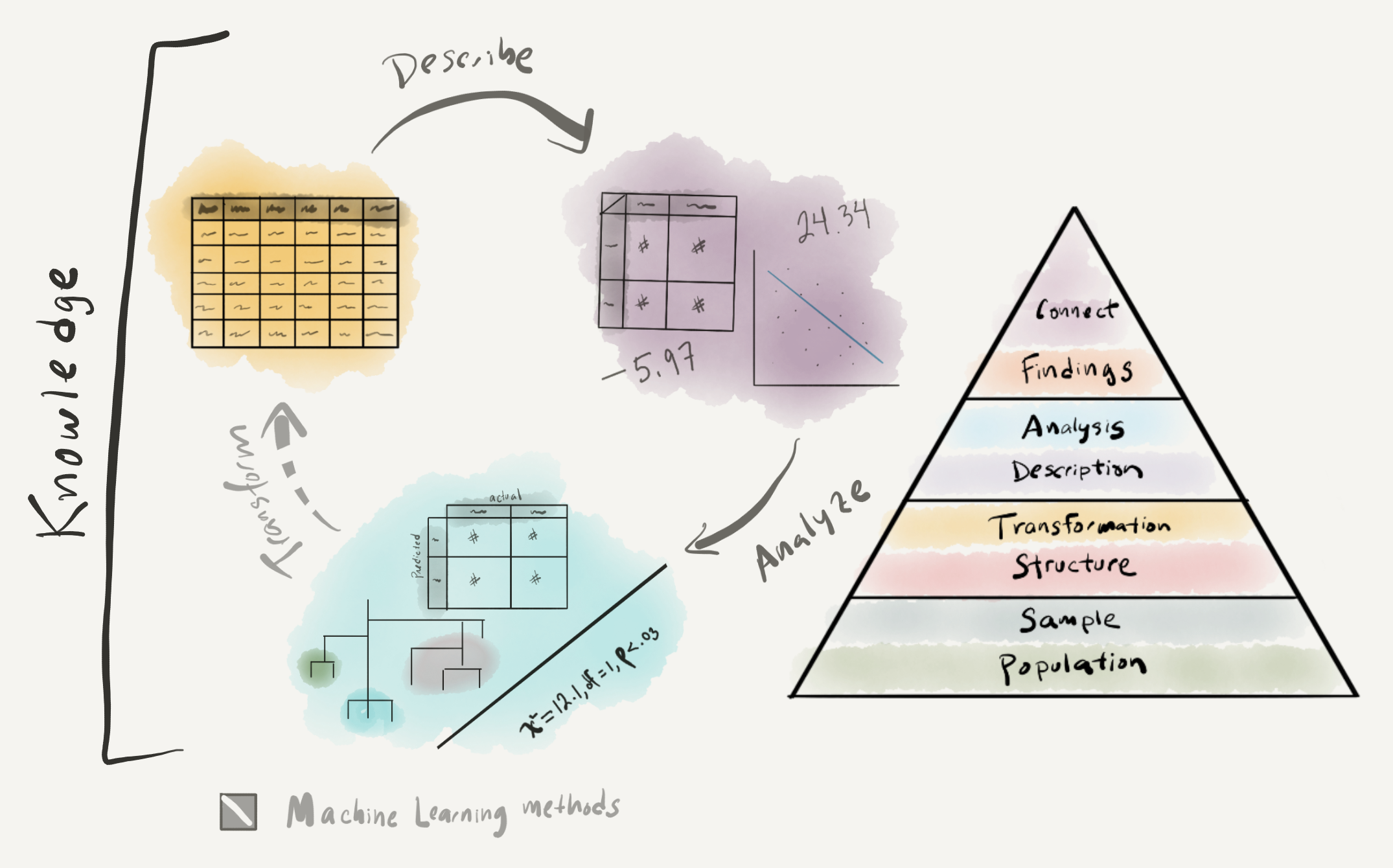
Figure 3.20: Approaching analysis: visual summary
Building on the strategies covered in Chapter 2 “Understanding data” to derive a rich relational dataset, in this chapter we outlined key points in approaching analysis. The first key step in any analysis is to perform a descriptive assessment of the individual variables and relationships between variables. To select the appropriate descriptive measures we covered the various informational values that a variable can take. In addition to providing key information for reporting purposes, descriptive measures are important to explore so the researcher can get a better feel for the dataset before conducting an analysis.
We covered three data analysis types in this chapter: inferential, predictive, and exploratory. Each of these embodies very distinct approaches to deriving knowledge from data. Ultimately the choice of analysis type is highly dependent on the goals of the research. Inferential analysis is centered around the goal of testing a hypothesis, and for this reason it is the most highly structured approach to analysis. This structure is aimed at providing the mechanisms to draw conclusions from the results that can be generalized to the target population. Predictive analysis has a less-ambitious but at times more relevant goal of discovering the extent to which a given relationship can be extrapolated from the data to provide a model of language that can accurately predict an outcome using new data. While many times predictive analysis is used to perform language tasks, it can also be a highly effective methodology for applying different algorithmic approaches and exploring relationships a target variable and various configurations of variables. The ability to explore the data in multiple ways, is also a key strength of employing an exploratory analysis. The least structured and most variable of the analysis types, exploratory analyses are a powerful approach to deriving knowledge from data in an area where clear predictions cannot be made.
I rounded out this chapter with a short description of the importance of reporting the metrics, procedures, and results from analysis. Reporting, in its traditional form, is documented in prose in an article. This reporting aims to provide the key information that a reader will need to understand what was done, how it was done, and why it was done. This information also provides the necessary information for reader’s with a critical eye to understand the analysis in more detail. Yet even the most detailed reporting in a write-up still leaves many practical, but key, points of the analysis obscured. A programming approach provides the procedural steps taken that when shared provide the exact methods applied. Together with the write-up a research compendium which provides the scripts to run the analysis and documentation on how to run the analysis forms an integral part of creating reproducible research.